
Why Straight Lines Make Better Predictions: Rohit’s Regression Journey (Part 3)
Rohit thinks he’s cracked regression. Varun knows he hasn’t. What follows is a chai-fueled quiz, a twist of curves vs lines, and a few hard truths about perfection. 📈☕ Ready for part 3?
Team Simply Explained
4/12/20256 min read


Rohit had been feeling like a stats wizard lately. After learning about scatter plots and the idea of drawing a line through data, he felt on top of the world. 📈😄
But Varun, as always, had a few more surprises waiting. And this time, the roles were about to reverse.
Let’s Flip the Classroom
Varun: Now that you’ve got the basics, how about a quick quiz?
Rohit: A quiz? Already? Have we even covered everything?
Varun: Chill, I didn’t mean I’ll quiz you. I want you to ask the questions. You’ve been curious — now’s your chance to play teacher. 😄
Rohit: Haha okay! Fair enough. Give me 10 minutes.
(He goes back to his desk, scribbles a few things, chews the back of his pen, then returns looking very serious.)
Rohit: Okay professor, I’m ready with my questions. Let’s see how much YOU know! 😏
Varun: Haha, bring it on.
❓ Question 1: Why do we use a straight line instead of a curve?
Rohit: Here’s my first question — why are we fitting a straight line instead of drawing a smooth curve through the points?
Varun: Ah, I love this one! Okay, imagine you’ve got a scatter plot where the points are all over the place — some rising, some falling, a few just floating randomly.
(Varun opens his laptop and pulls up a graph.)
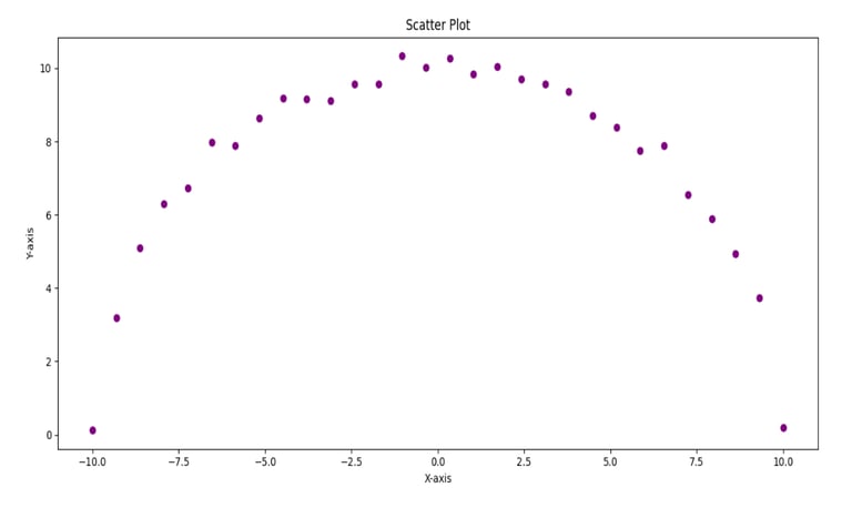
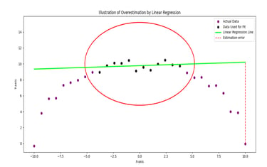
Varun: Look at this. The pattern here goes up sharply at first, then flattens, and finally dips. It's not a straight path.
Rohit: Yeah bro, it doesn’t look like anything a line would fit. It’s steep at the start, almost stable in the middle, and then again drops.
Varun: Exactly. If you had to name the shape, what comes to mind?
Rohit: Maybe... a semi-circle? Or a parabola?
Varun: Bang on! So now, let’s consider 2 cases
Case 1: The trend is evidently not close to linear, but you still assumed it to be a line.
Problem with case 1: When you build the linear model with training data and test it, you will see very significant errors for the test data.
Solution: You reject the linear model and go for a meaningful model.
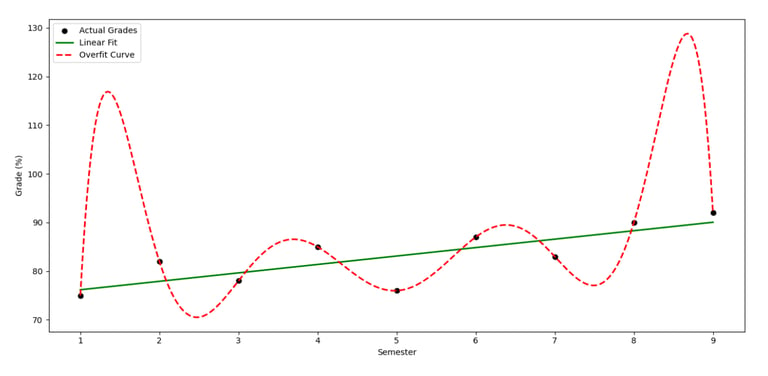
Case 2: It is close to a line but you still wanted to be perfect and fitted a smooth curve passing through all the data points, instead.
Problem with case 2: You want to be so perfect that you start believing the output is completely influenced solely by the input you picked and no uncertainty is ever possible. This will leave you with far off predictions from actuality.
Solution: Do not try to be perfect with a curve, instead go for a line that leaves room for uncertainty.
Your question is addressed by case 2. So, it is called overfitting in statistics. In essence, I don’t want to discourage you from drawing a curve, but you should be wise to choose the right option for the context.
Rohit: So it’s like trying to remember every single line from the textbook — and getting confused when even a small detail changes?
Varun: That’s the perfect analogy. Overfitting memorizes the data, not the trend.
(He opens another graph.)
Varun: Now look at this — your actual semester-wise marks: 75%, 82%, 78%, 85%, 76%, 87%, 83%, 90%, 92%. Not linear either, right?
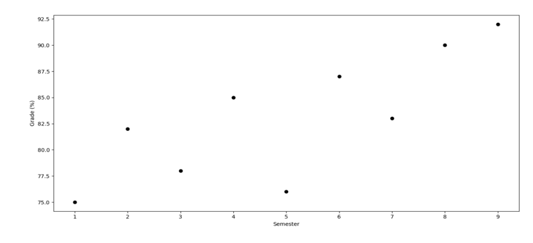
Rohit: Yep. My grades were all over the place.
Varun: Exactly. Now imagine drawing a fancy curve through each one of those points. It might dip at weird places and could predict something like 65% for your 10th semester — even though the trend shows growth. That’s misleading.
Rohit: Hmm... So instead, we draw a straight line that shows the bigger picture?
Varun: Yes! It simplifies the story. It says, “Overall, you're on an upward trend,” even if you had a couple of low points. And that’s what helps when we want to predict something new — whether it's your next mark or a business’s next quarter sales.
Rohit: Got it. A straight line is like saying — let’s not get distracted by every small bump. Let’s focus on the journey.
Varun: That’s why linear regression works. Not perfect. But practical, smart, and stable. 😄
🧪 Another Example: Predicting cricket scores 🏏
Varun: Let’s say a batsman scores: 32, 40, 28, 45, 50, 35, 60, 38, 42, 36 in 10 matches. Now guess the next one.
If you fit a perfect curve, you might predict 5 or 95 — totally off! But if you fit a straight line, it might predict around 40. Not perfect, but safe.
Rohit: Makes total sense. It’s like being wise instead of flashy!
Varun: Well said 😄
❓ Question 2: Do we always use all the data?
Rohit: Okay next — we have all this data, right? Why not use all of it to draw the line?
Varun: Smart question! Let me ask you this — if you studied only class notes, and then got 100% in class tests, does that mean you’re ready for the final exam?
Rohit: Hmm... maybe not. What if the final asks something I never practiced?
Varun: Exactly! That’s why we don’t use all the data at once.
We split it:
80% for training — to draw the line.
20% for testing — to check if the line works well on new data.
If the model works well on both, we know it’s reliable. 💡
Rohit: So the test part is like mock exams!
Varun: You got it! And if the model messes up during testing — like predicting 100 when the actual was 45 — we know something’s wrong.


❓ Question 3: Why input on X and output on Y?
Rohit: Okay now tell me — why is input always on X and output on Y? Who decided this?
Varun: 😄 Okay. Think of a train. The engine is the input — it leads. The coaches are the output — they follow. Just like that, input leads, output follows.
That’s why we write it as y = f(x). Output depends on input.
Also, it’s a universal rule. Like writing your name as “Rohit,” not “tihOR.”
Rohit: Bro that’s so true! 😂
Varun: So, in regression, we always call X the independent variable and Y the dependent variable. Because Y depends on X.
❓ Question 4: Can’t I just look at the graph?
Rohit: Okay last question. If we already have a graph, can’t I just eyeball it and guess the next point?
Varun: Haha! You can, just like you can guess your marks by your gut feeling before results. But will it be accurate?
Rohit: Not always...
Varun: Exactly. For solid predictions — like sales, scores, stock prices — we need a proper formula. That’s where the regression equation comes in.
Rohit: And that’s where the scary maths begins, right? 😬
Varun: Don’t worry, we’ll go slow. One sip of chai ☕ at a time.
Rohit: Haha, I’m in. Math after masala chai!
📈 So, How Is This Useful in Real Life?
Rohit: Okay, be honest. Is this stuff even used outside class?
Varun: Oh 100% yes. Regression is everywhere! Let me give you some real-life scenes:
🛒 Marketing: Brands predict which ads work best by seeing how spend affects sales.
🏠 Real Estate: Price of a house? Depends on location, size, and age — all perfect for regression.
🏦 Finance: Banks use it to check if someone might repay or default on a loan.
📱 Apps & eCommerce: Platforms use it to show prices or discounts based on past trends.
Rohit: Wow. So basically... if you get this, you can predict anything?
Varun: Almost! 😉 If you understand trends, you make smarter decisions — in cricket, careers, or even cooking videos on YouTube!
✅ Takeaway
A straight line is like a wise friend — not perfect, but dependable.
Overfitting tries to show off — and ends up wrong.
Training and testing split makes sure your model doesn’t cheat.
X leads, Y follows. Engine and coaches. 🚂
And yes, regression isn’t just theory — it’s powering businesses all around us.
📘 Next up: Varun finally teaches Rohit the actual regression equation — without turning it into a math horror story!
Insights
Weekly blogs simplifying various intriguing topics.
Connect
Explore
contact@simplyexplained.com
Copyright © 2025 Simply Explained Powered by DigiPar