
How Regression Helped Rohit Pick the Right Bowler – Simply Explained (Blog 2)
Rohit uses data, patterns, and regression to choose the right bowler in a rain-hit match. A simple, story-based intro to scatter plots and line of best fit—no jargon, just cricket fun!
Team Simply Explained
4/6/20255 min read


Welcome back! In the last story, Rohit realized that predicting outcomes is about more than just guessing averages. He learned that linear regression helps when multiple factors influence the result. But he still had questions.
Now, let’s take the story forward. This time, the stakes are higher — and so is the need to think statistically. 🧠
The Scene: A Rainy Twist in the Match 🌧️
It was a sunny day… until 4 PM. Suddenly, clouds took over.
India and Pakistan were mid-way through an international T20 match. India had batted first and scored 127 runs in 20 overs.
During Pakistan’s innings, the rain started to drizzle. After 10 overs, the officials decided to reduce the match.
Using the Duckworth-Lewis method, the new target was set at 70 runs in 11 overs.
📝 Duckworth-Lewis method (DLS): It’s a method used to revise cricket targets in rain-affected matches. It considers overs left, wickets lost, and scoring patterns to adjust the target fairly.
The Situation: “So we’re nearing the end now?” ⏳
At the end of 10 overs, Pakistan had scored 66 runs.
That meant they needed just 4 runs in the last over to win.
The scoreboard showed the runs scored for the past 10 overs.
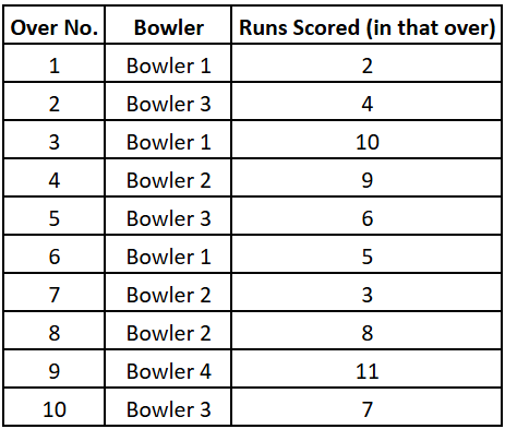
Rohit looked at the data and asked:
Rohit: “Wait, where are the wickets? Who’s batting? I need more data.”
Varun: “Haha, I don’t have the full picture. But here’s what we know: only the last two batsmen are at the crease. And we have bowling speeds for each over.”
Rohit: “Alright. So what do we do with this?”
Varun: “There’s just one over left. Say you’re the captain of the bowling side.”
Rohit: “Okay. Tell me who’s bowled already.”
Varun: “Bowlers 1, 2, and 3 have finished their spells. Your options for the final over are Bowler 4 or Bowler 5.”
Rohit: “Do we have any data on them?”
Varun: “Yes. We know the bowling speed of each bowler across the last 10 overs. And we also have the runs conceded per over.”
Varun showed a table with bowling speeds and scores.
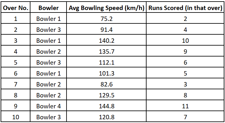
Reading the Data 📊
Rohit: “I know nothing about Bowler 5. How do I decide?”
Varun: “That’s a good point. But maybe you should ask me something else.”
Rohit paused. Then looked again at the data.
Rohit: “Hold on… Looks like the batsmen are scoring big off fast bowlers, while slower bowlers are controlling the runs.”
Varun: “Exactly!” ✅
Rohit: “Then what’s Bowler 5’s average speed in past games?”
Varun: “150 km/h.”
Rohit: “Way too fast. That’ll be risky. I’ll go with Bowler 4.”
Varun: “Smart. But what advice will you give Bowler 4?”
Rohit: “I’ll tell him to bowl under 101 km/h to keep runs under control.”
Varun: “And why 101?”
Rohit: “Because the batters seem to struggle with lower speeds. My goal is to keep their score in this over under 4.”
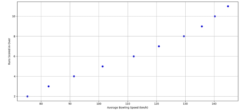
Enter the Scatter Plot 📈
Varun: “Great! You’ve just used logic like a true statistician.”
Rohit: “But all I did was spot a pattern in the table.”
Varun: “That’s how it starts. You’ve spotted it mentally. But here’s how a statistician would confirm it visually using scatter plots.”
Varun pulled up a plot showing scores vs bowling speeds.
Rohit: “Nice! Looks like as bowling speed increases, the runs go up.”
Varun: “Right. That’s the kind of pattern we look for.”
Patterns vs Randomness
Rohit: “But don’t all plots show some pattern?”
Varun: “Not really. Look at this plot of over number vs runs scored.”
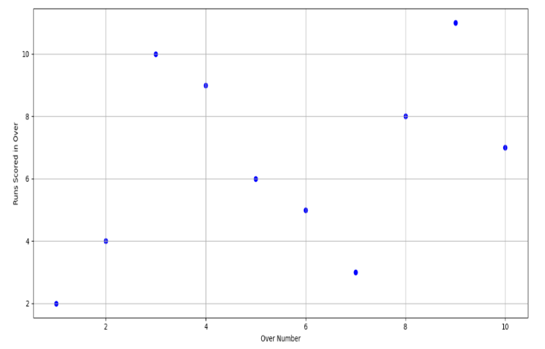
Rohit: “Oh! No pattern here. Runs seem random across overs.”
Varun: “Exactly. That’s what makes a scatter plot useful — it helps you check if there's a trend between two variables.”
The “Linear” in Linear Regression 📐
Rohit: “Okay. But how is this connected to regression?”
Varun: “Linear Regression is about drawing a straight line through points on a scatter plot — a line that best represents the trend.”
Rohit: “So that’s what ‘linear’ means — a straight line?”
Varun: “Yep!”
Drawing the Line
Varun: “Now, imagine this — how many lines can you draw through a single point?”
Rohit: “Infinite.” ♾️
Varun: “And through two points?”
Rohit: “Just one.”
Varun: “And through three distinct points?”
Rohit: “Unless they’re collinear, I’d form a triangle.” 🔺
Varun: “Exactly. When points aren’t on the same line, drawing a perfect straight line through them all isn’t possible.”
The Line of Best Fit 🧩
Rohit: “So, we cheat and draw a curve?”
Varun: “In regression, we still draw a straight line — but we choose the one that fits best among many.”
Rohit: “How do we decide which one fits best?”
Varun: “By picking the line that has the smallest total distance from all points.”
Rohit: “But each point has its own distance. How do we sum them?”
Varun: “We calculate the perpendicular distance from each point to the line and find the line that minimizes the sum of all those distances.”
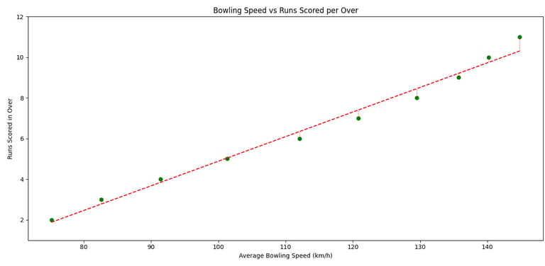
Rohit: “Oh! So that orange line on the chart is the line of best fit?”
Varun: “Exactly. It doesn’t pass through every point. But it represents the overall trend well.”
Rohit: “So that line tells us: lower speed = fewer runs.”
Varun: “Yes — and it gives you a prediction line too. That’s how businesses use regression.”
Rohit: “Now I get it. Regression doesn’t give you a perfect line — it gives you the most reasonable one. So, basically regression is like matchmaking — you won't get perfect, but you get ‘suitable one’.” 💍
Varun: “Haha, Exactly. And that’s why we don’t just guess. We use logic, data, and visuals like scatter plots.”
Rohit: “Okay, okay… I finally get what regression does.”
Varun: “So, ready to build your own model now?”
Rohit: “Absolutely. But only if it helps me predict whether the mess food tonight is edible or not.” 🍛
Varun: “That’s not regression. That’s a miracle.” 😄
The Takeaway 🧠
Rohit used logic, a scatter plot, and regression to pick the right bowler. He didn’t guess. He analyzed.
You can too.
Why This Matters
➡ In cricket, regression helps teams analyze patterns and strategize better.
➡ In business, regression helps predict:
📊 Sales based on ad spend, season, and pricing
🛒 Revenue based on customer behavior and discounts
💹 Stock prices using past trends and market indicators
➡ In finance, it's used to:
🔐 Estimate risk in investment portfolios
💳 Forecast loan defaults based on credit history
🏠 Predict housing prices based on size, location, and age
Final Thoughts
➡ A scatter plot helps you see if there’s a pattern between two variables.
➡ Linear regression finds the straight line that best fits that pattern.
➡ The best line is the one with the least total perpendicular distance from all points.
➡ In real life, you use this to make smarter choices — whether it’s cricket, business, or life. 💡
Up next in this series:
📘 Common terms and definitions used in regression (in very simple language)
🔍 What makes a regression model “good”?
🤖 What’s an error term?
➕ What happens when you add more variables?
🛠 And how to use all this in real-world decisions.
👉 Missed the first article? Click here to read how Rohit first discovered linear regression.
📬 Got a topic that still confuses you? Email us at contact@simplyexplained.in — we’ll break it down. No jargon. Just stories.
Insights
Weekly blogs simplifying various intriguing topics.
Connect
Explore
contact@simplyexplained.com
Copyright © 2025 Simply Explained Powered by DigiPar